House
Logo
Logo anatomy
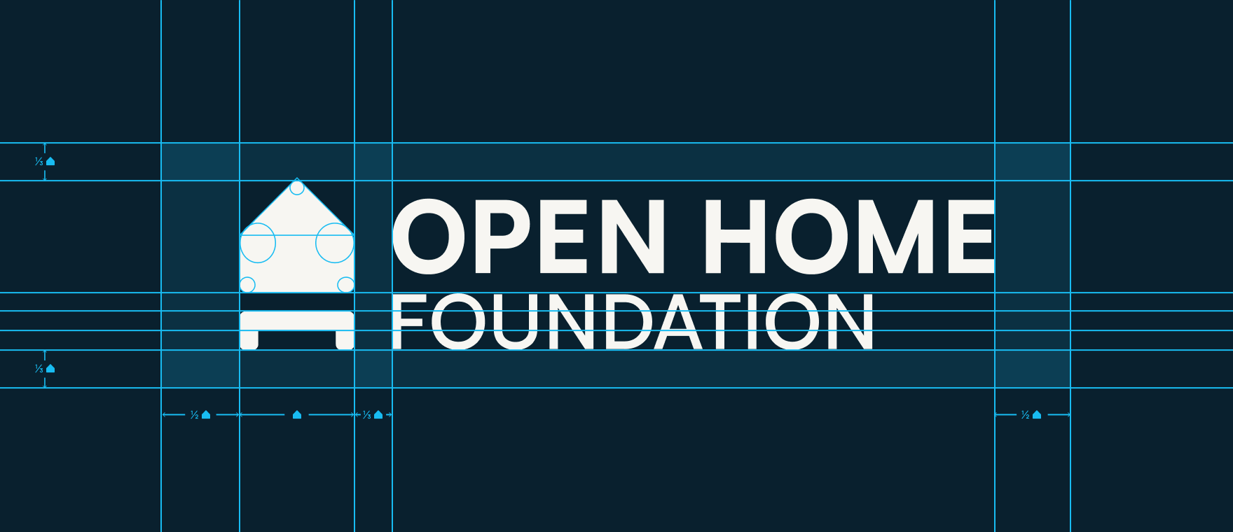
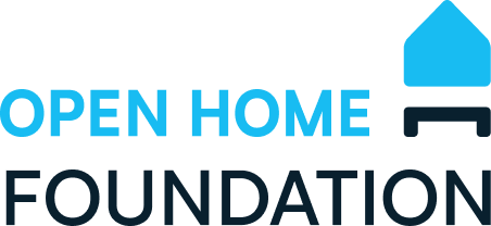
Section titled “Logo anatomy”The Open Home Foundation is built up of 3 elements as described below.
Foundation
Blue
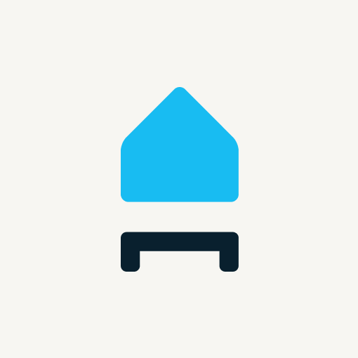
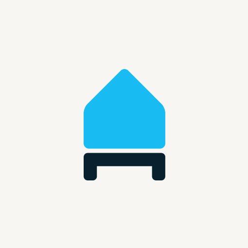
We’re all about the home, so our logomark follows its form. As a structure with a pitched roof is commonly used to represent a house, there are vast amounts of logos based on this shape – so we’ve refined it to make it more iconic. You’ll notice there is no gable, chimney, or other details, simply an orthogonal shape with elegant proportions. This house shape then forms the ‘enclosure’ in the logomarks of every project that is part of the foundation.
Foundation
Section titled “Foundation”In the case of the Open Home Foundation logomark, the house shape is supported by a rectangular platform with two solid dark blue “legs”, symbolizing its foundations (and our foundation!). This connection to the ground represents the stability and structure we aim to provide via our projects and principles.
Blue feels stable and essential. A bright sky blue is joyful, clear, and free of clouds.
Logotype
Section titled “Logotype”The logotype is what we call our organisation’s name when it’s styled up in our official typeface and color, and is used in combination with the logomark described above. The headline typeface for the Open Home Foundation brand is Biotif in all capital letters.
The words “Open Home” are in bold, while the word “Foundation” is smaller in medium font weight, to reflect our emphasis on the open home.
The word “Foundation” in the logotype is in the same dark blue color as the foundation “legs” in the the logomark to strengthen the connection between the two elements.
We prefer the logotype to be aligned to the left by default.
Design and clearspace
Section titled “Design and clearspace”The following sectrion describes the design of the logo and the clearspace that should be maintained around it to ensure its visibility and impact.
Layout and Color variations
Section titled “Layout and Color variations”See brand assets for the various layout variations of the logo and use cases.
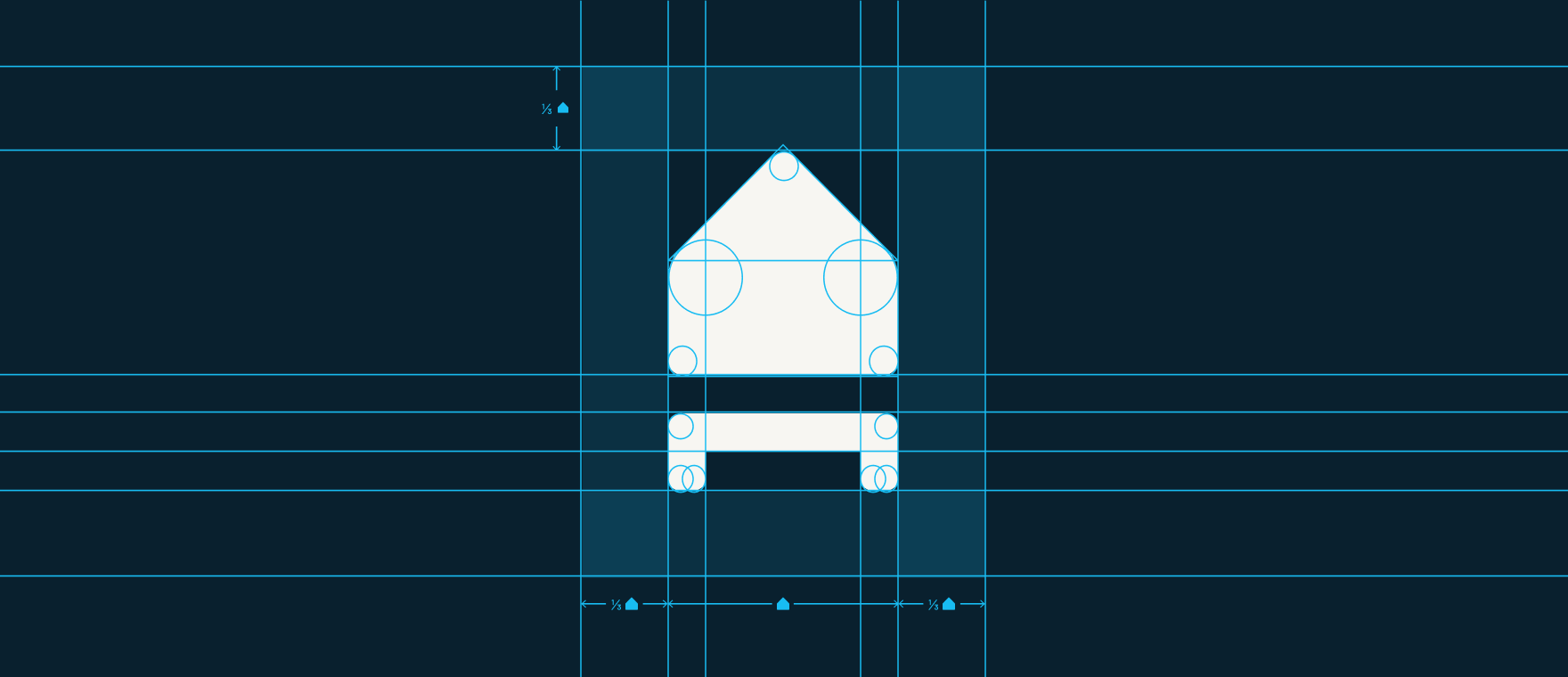
Grid and proportions
Section titled “Grid and proportions”The logo has been designed following a rigid scheme of proportions – please do not change this ratio in any way. Use the main modular unit, on which the entire logo is based, to define the grid. All other graphic elements should also be designed on this grid. As the grid is built on a square module, the vertical proportions depend entirely on the horizontals.
It is important to keep the logo free from other graphic elements. To help you regulate this, we’ve created an exclusion zone around it, which is equal to one third of the width of the icon. This exclusion zone indicates the minimum area around the logo that must be kept free of other graphic elements.
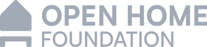
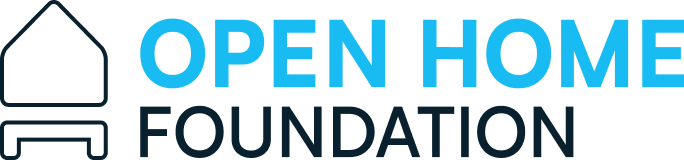
Deprecated logos
Section titled “Deprecated logos”Some older versions of the Open Home Foundation logo are now deprecated and should not be used. Please follow these official visual guidelines to ensure consistent and correct branding and only use approved logos.
What to avoid
Section titled “What to avoid”The logo has relative sizes and proportions determined by the criteria of composition, hierarchy and functionality. Under no circumstances should these sizes and proportions be altered – here are some examples of what to avoid:
Don’t distort or rotate the logo in any way. Don’t change the dimensions or move any logo element.
Don’t place the logo against any background that doesn’t create contrast.
Don’t change the original solid color with an outline.
Don’t add drop shadow.
Don’t change letter spacing.
Don’t change any color, don’t add any kind of gradient. Use only the selected color palette.